
The brief
Senia is a fictional digital agency I created to show my process end to end. It needed a website that feels as premium as its identity: confident, calm and clearly built by people who know digital, so a visitor trusts it within seconds.
After designing Senia's identity, I took the brand online: a four-page website for the agency, designed and hand-built from scratch, with motion that guides the eye instead of showing off.
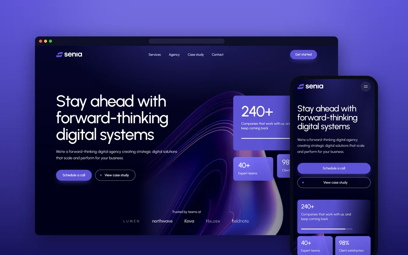
Senia is a fictional digital agency I created to show my process end to end. It needed a website that feels as premium as its identity: confident, calm and clearly built by people who know digital, so a visitor trusts it within seconds.
Start from the brand, not a template. The site grows out of the landing page I designed for the identity, then adds pages a real agency needs, a client story with results, and a motion system that makes the whole thing feel alive.
A fast, hand-built website that works on any screen, from a large monitor to a small phone. Every page shares one system of type, colour and movement, so it feels like one place rather than a stack of pages.
Home, Services, Agency and Contact, plus a full client story. Hover a page to scroll through it, or open it on the live site.
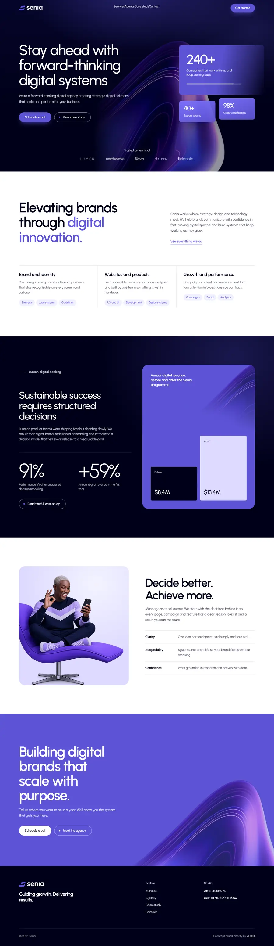 HomeHero, numbers, services and a client result
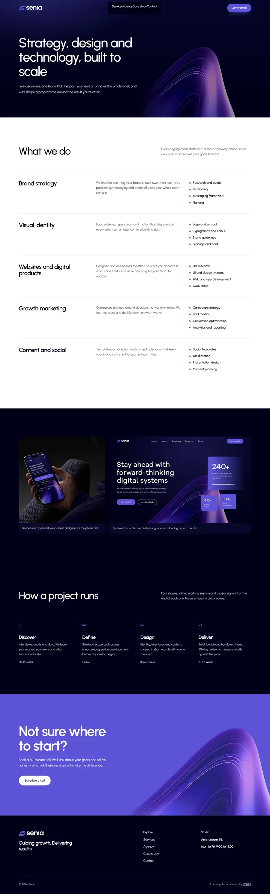 ServicesFive disciplines and how a project runs, step by step
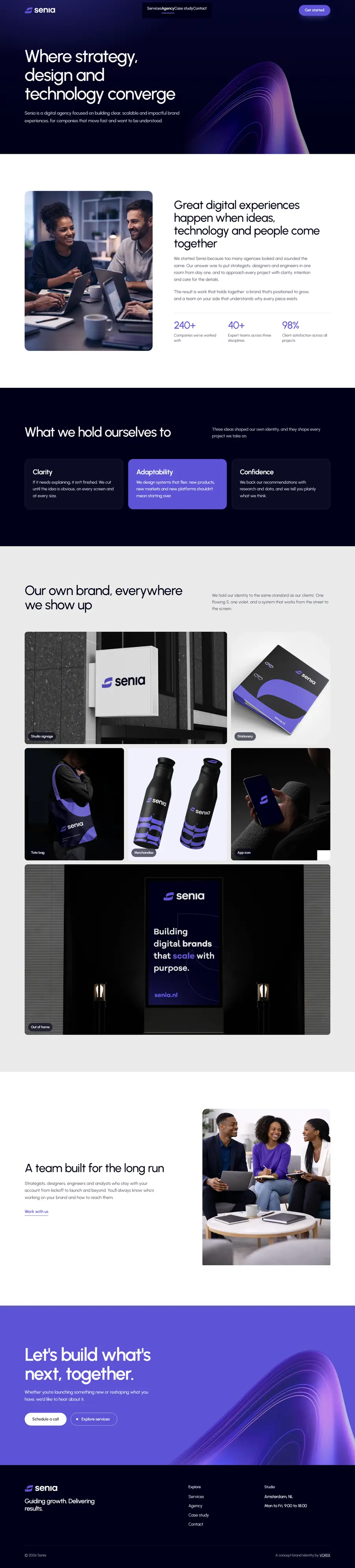 AgencyThe team, its values and the brand in use
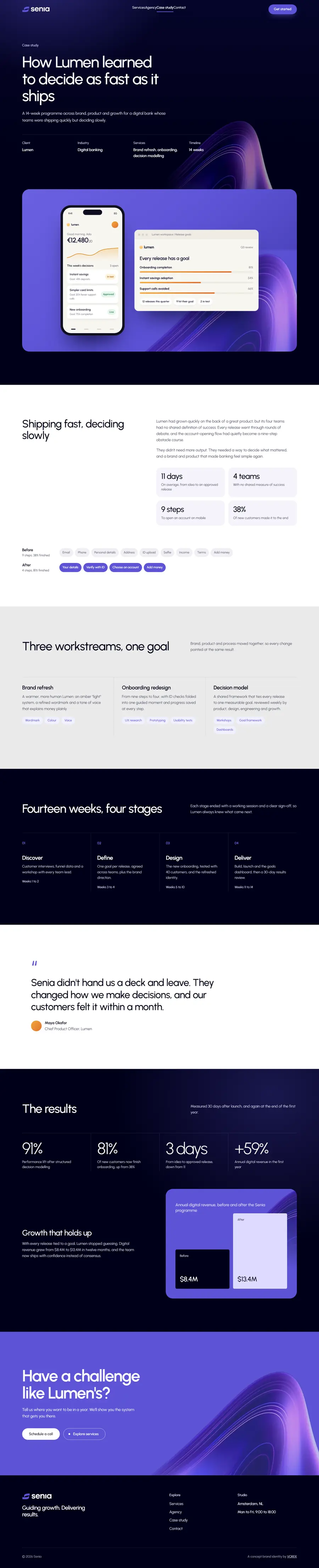 Client storyLumen: app and dashboard mockups built in pure HTML and CSS
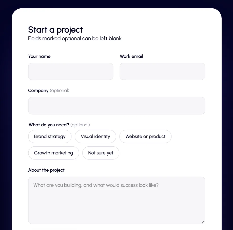
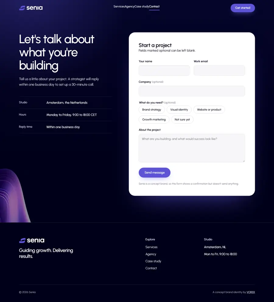 ContactA short, friendly project form with instant checks
Live site
seniaagency.pages.dev
Screenshots are still. The site is not. Open it to feel the motion.
Visit the site
Every choice on the site traces back to the identity, so the brand and the website feel like one thing.
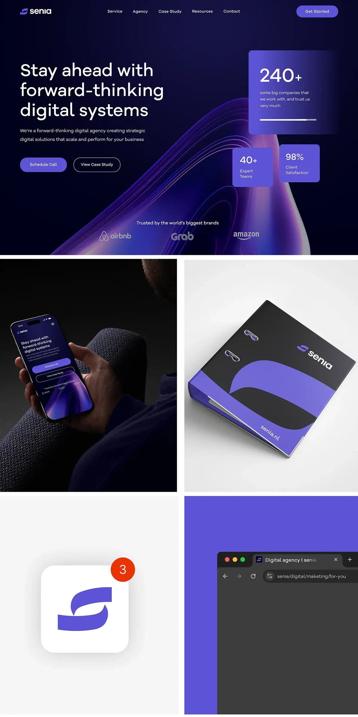
The identity already included a landing page design. The home page follows it closely: the dark hero, the 3D violet wave and the three number cards. The other pages extend that same layout language.
The brand typeface, Galano Grotesque, is a paid font. For the website I chose Urbanist, a free web font with the same round, geometric feel, so the site loads quickly and costs nothing to run.
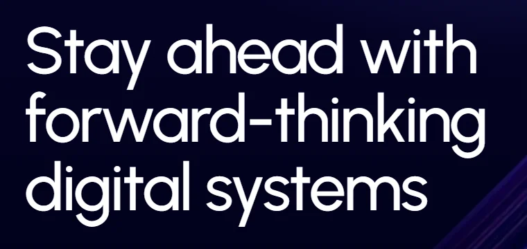
Two colours carry the site: a deep night blue for calm, premium backgrounds and Senia violet for actions and highlights. White sections in between give the eye a rest.
Movement on the site guides attention and makes it feel crafted. First-time visitors get a short logo intro, and the hero gently recedes as you scroll.
Big headlines rise into place one word at a time, so they read like a sentence being spoken.
An image arrives together with its frame as you scroll, then the photo drifts gently inside it.
Figures like 240+ and 98% count up from zero the moment they come into view, so the numbers land.
On desktop, scrolling glides and settles instead of jumping in steps, which makes long pages feel calm.
Buttons lean slightly toward the cursor as it gets close, a small invitation to click.
Moving to another page fades the old one into the new, so the site feels like one continuous space.
The site checks how smoothly it is running. On a slower device it quietly drops the heaviest effects and keeps the rest.
If a visitor has asked their device for less motion, everything appears instantly and nothing moves.
Each page was designed for desktop and phone, not just shrunk to fit. On mobile, layouts stack, buttons grow to thumb size and the menu folds away.
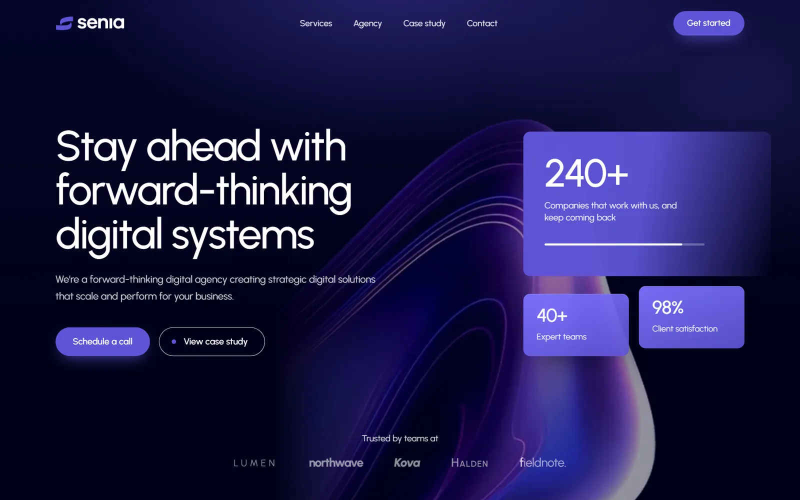
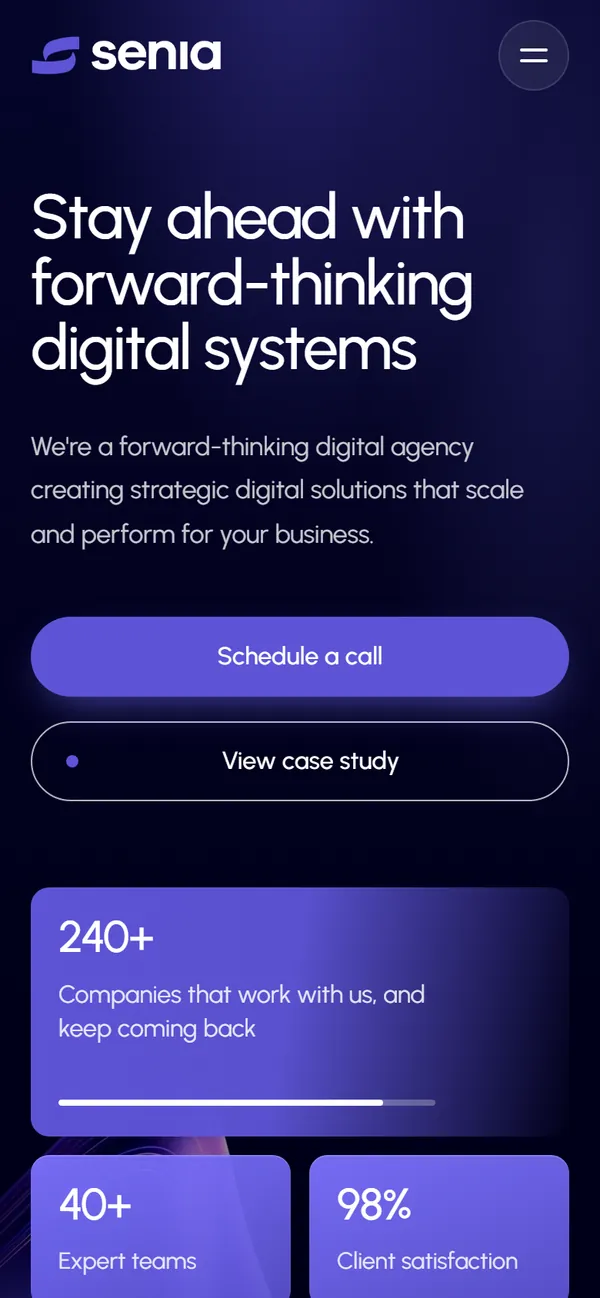
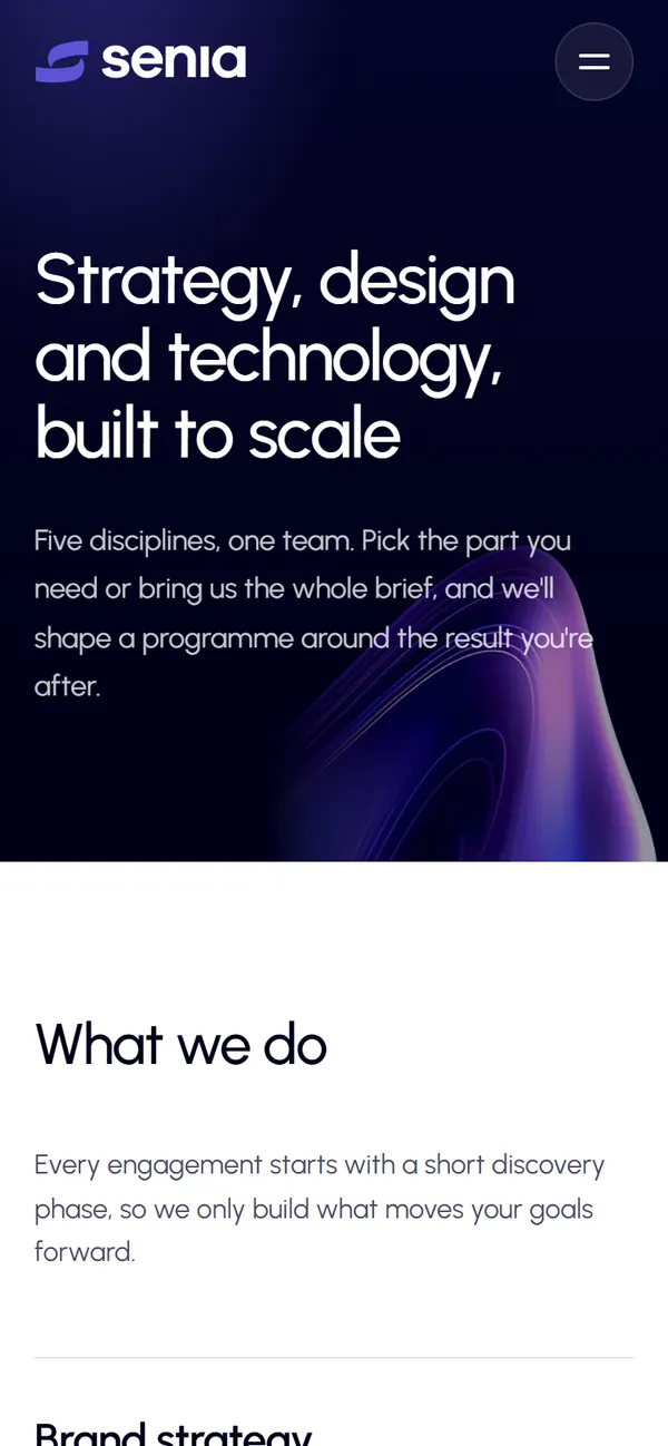
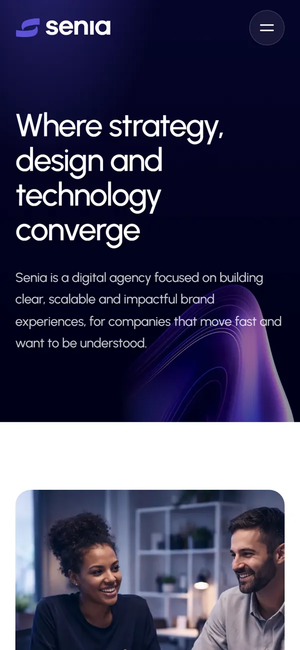
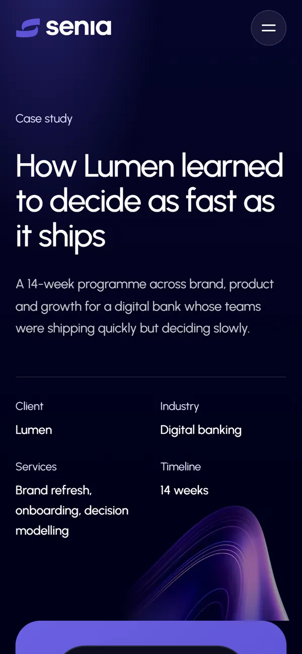
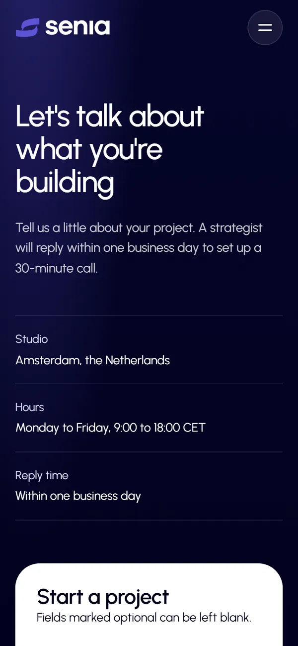
The site is written by hand in plain HTML, CSS and JavaScript, with no page builder or heavy framework. That keeps it quick to load, easy to host for free, and simple to update.
It is accessible by default too: real headings, keyboard-friendly menus and forms, readable contrast, and a contact form that checks each field and explains what is missing.
Where it started
Tell me about your idea in a few lines. On a free discovery call we'll talk through your goals and I'll put together a clear quote.